Turning API chaos into a single source of truth
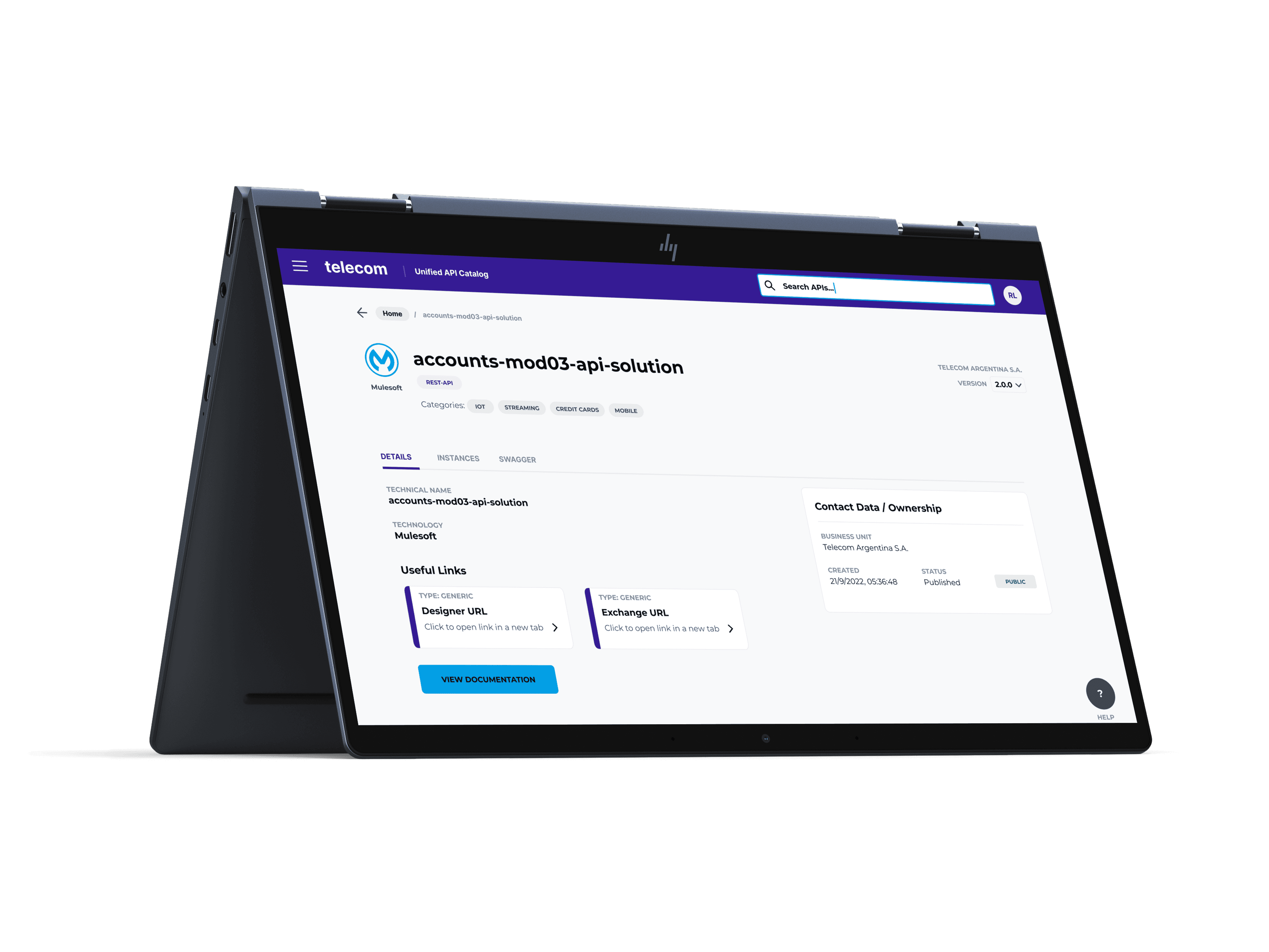
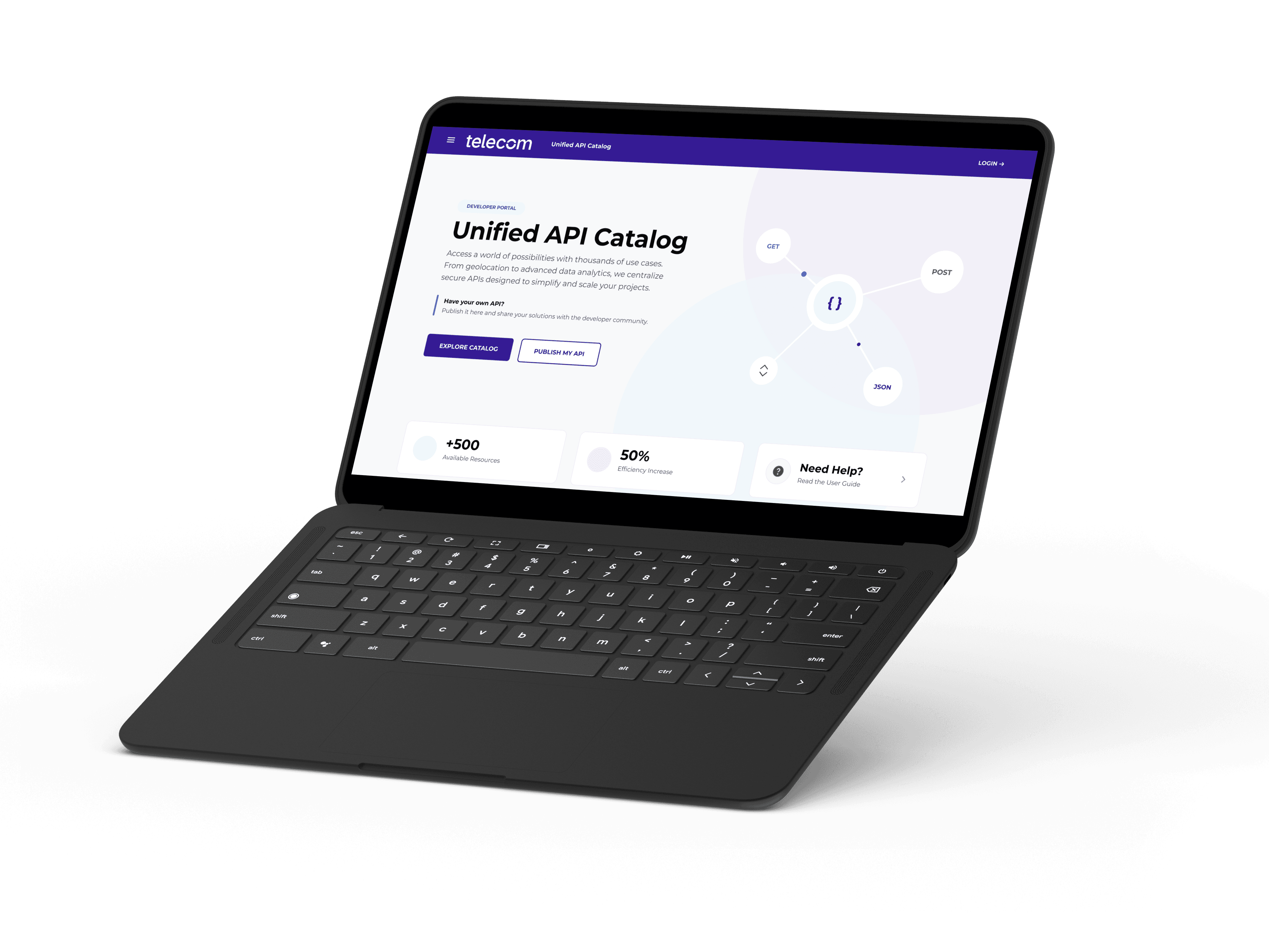
Final UI: the API catalog dashboard, designed for developers scanning hundreds of endpoints daily.
Before this portal existed, developers spent hours hunting for APIs across disparate third-party sites, evaluating specs on their own, and sharing unorganized links across the team. Information got lost, effort got duplicated, and the engineering department was stuck with a workflow nobody had designed on purpose.
I was hired as a UX team of one, which meant the challenge was two-fold — one cultural, one technical.
Earning a seat for UX
The environment was IT-driven, and management initially treated user research and testing as an unnecessary cost. Working closely with the project manager, I made the case for the ROI of UX validation, then integrated into their existing agile process — Jira, Trello, daily stand-ups — so testing became part of how the team already worked, not an extra step.
Designing for scale, not just for now
The brief was a desktop-first internal tool. But the long-term vision was to evolve it into a public-facing SaaS portal for external clients, so the architecture had to hold up under a scope it didn't start with.
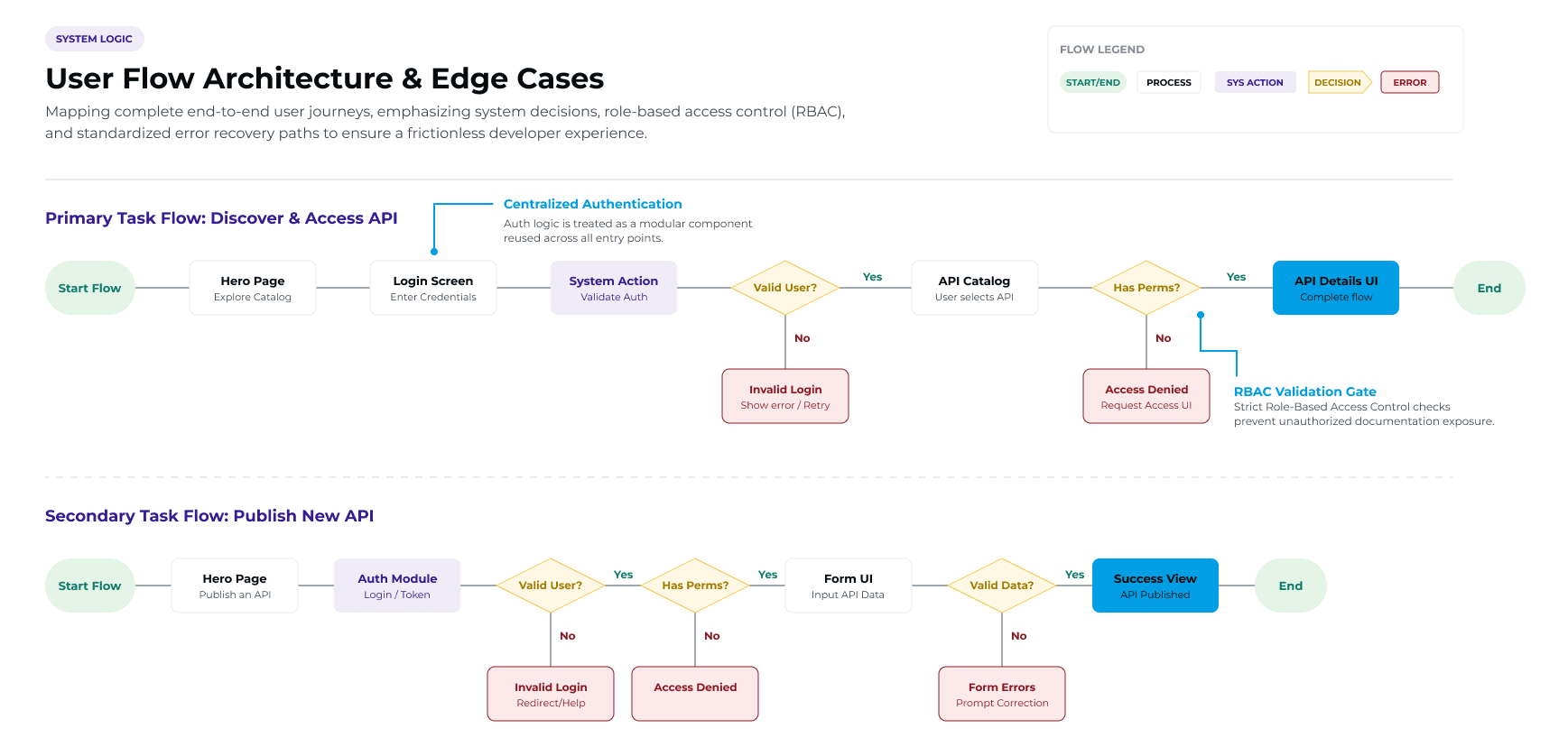
Mapping user flows came first — without it, the testing sessions that followed would have been built in the dark. I ran remote, moderated sessions with consent-based screen recording, then brought concrete metrics and specific friction points back to management alongside immediate iterations. Seeing the fixes land in real time is what shifted UX from "nice to have" to a working part of the process.
With tight deadlines, I skipped straight to mid-fidelity as little as possible. Paper sketches became structural wireframes fast, which gave the team something concrete to sync around — aligning expectations with the lead developer and correcting course before any pixel was designed twice.

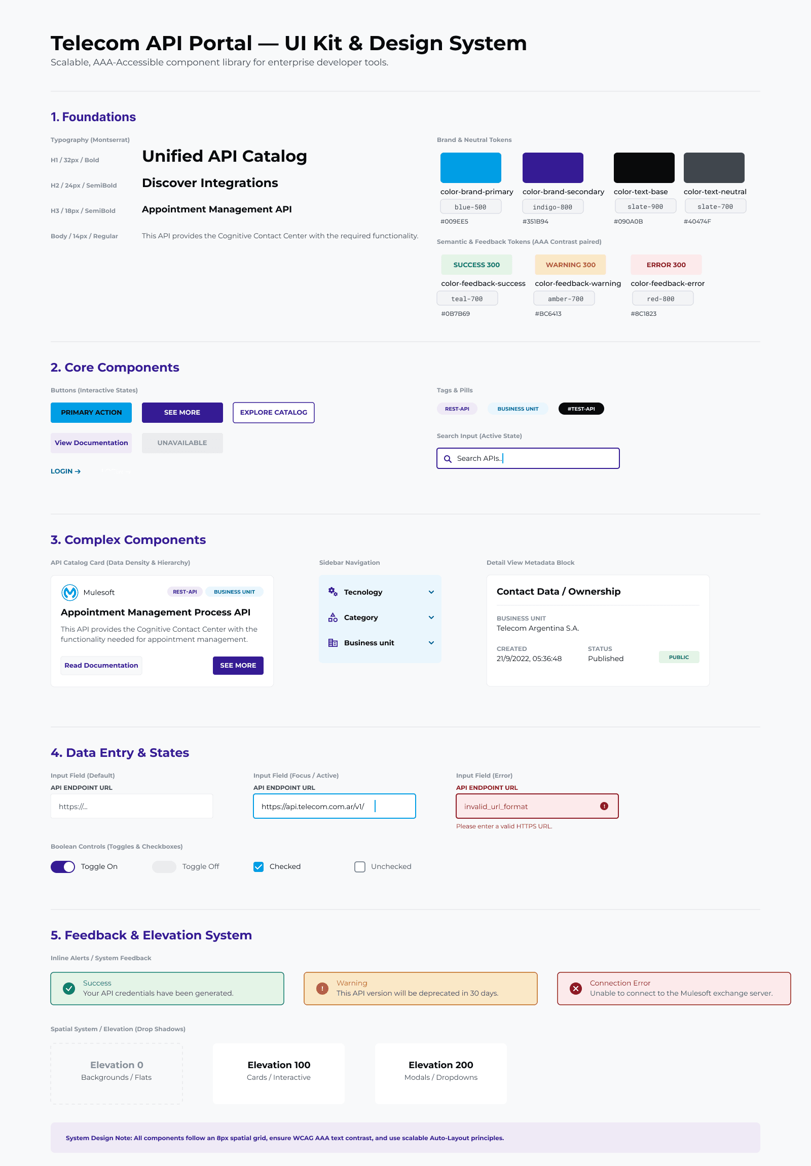
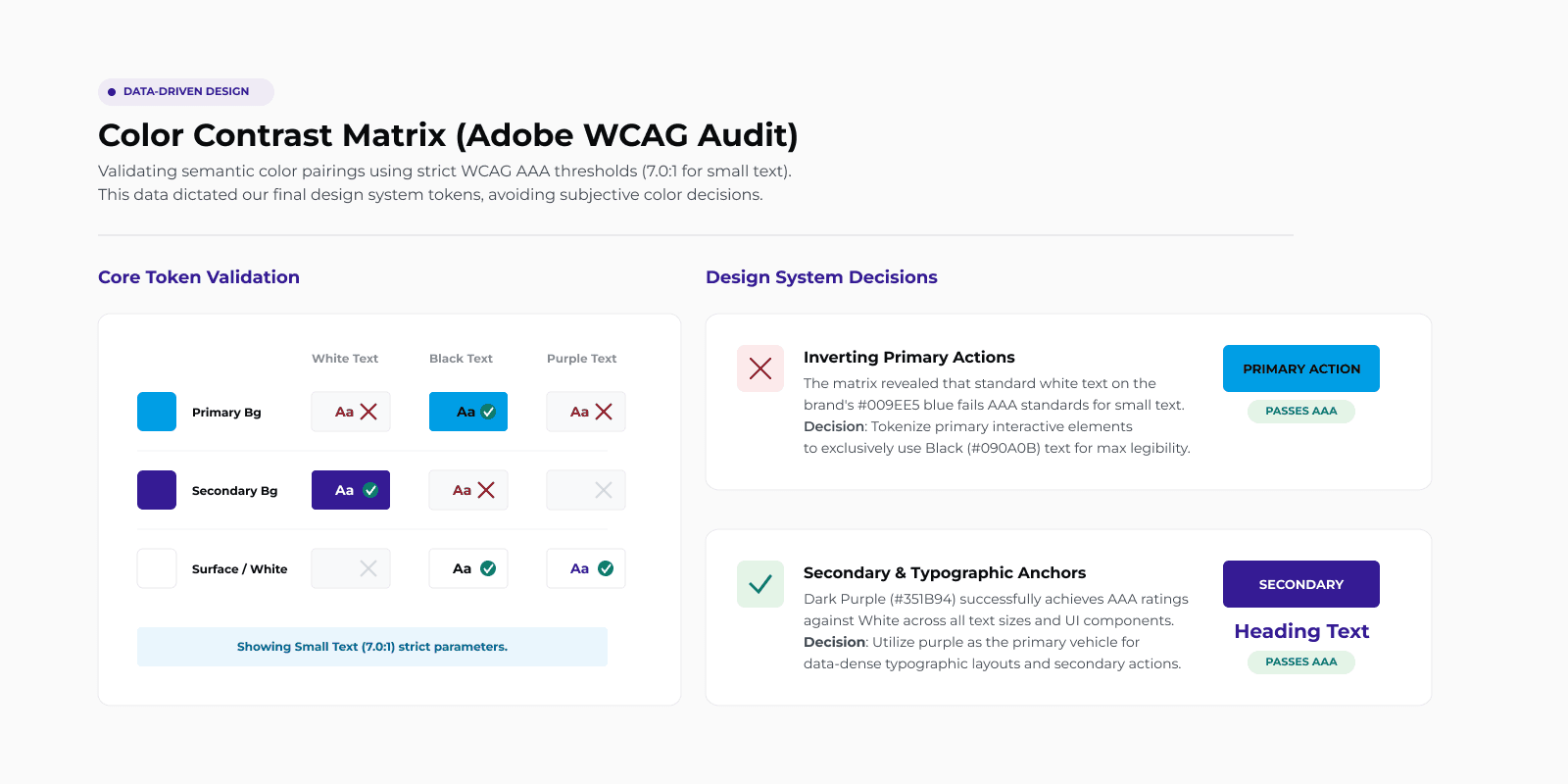
The interface had to follow Telecom's corporate branding while meeting AAA accessibility standards — a high-contrast, low-noise layout built specifically for developers scanning hundreds of technical endpoints in a single sitting. I built the whole thing as a component library in Figma, so handoff to development stayed frictionless.
Working autonomously, the portal shipped inside the original timeline and changed how the engineering team actually worked.
Reduction in time developers spent searching for and managing APIs.
Built on a scalable foundation, ready to become an external SaaS platform next.
Management's read on UX moved from "bottleneck" to a required quality standard.