Rebuilding a parking app that failed accessibility basics
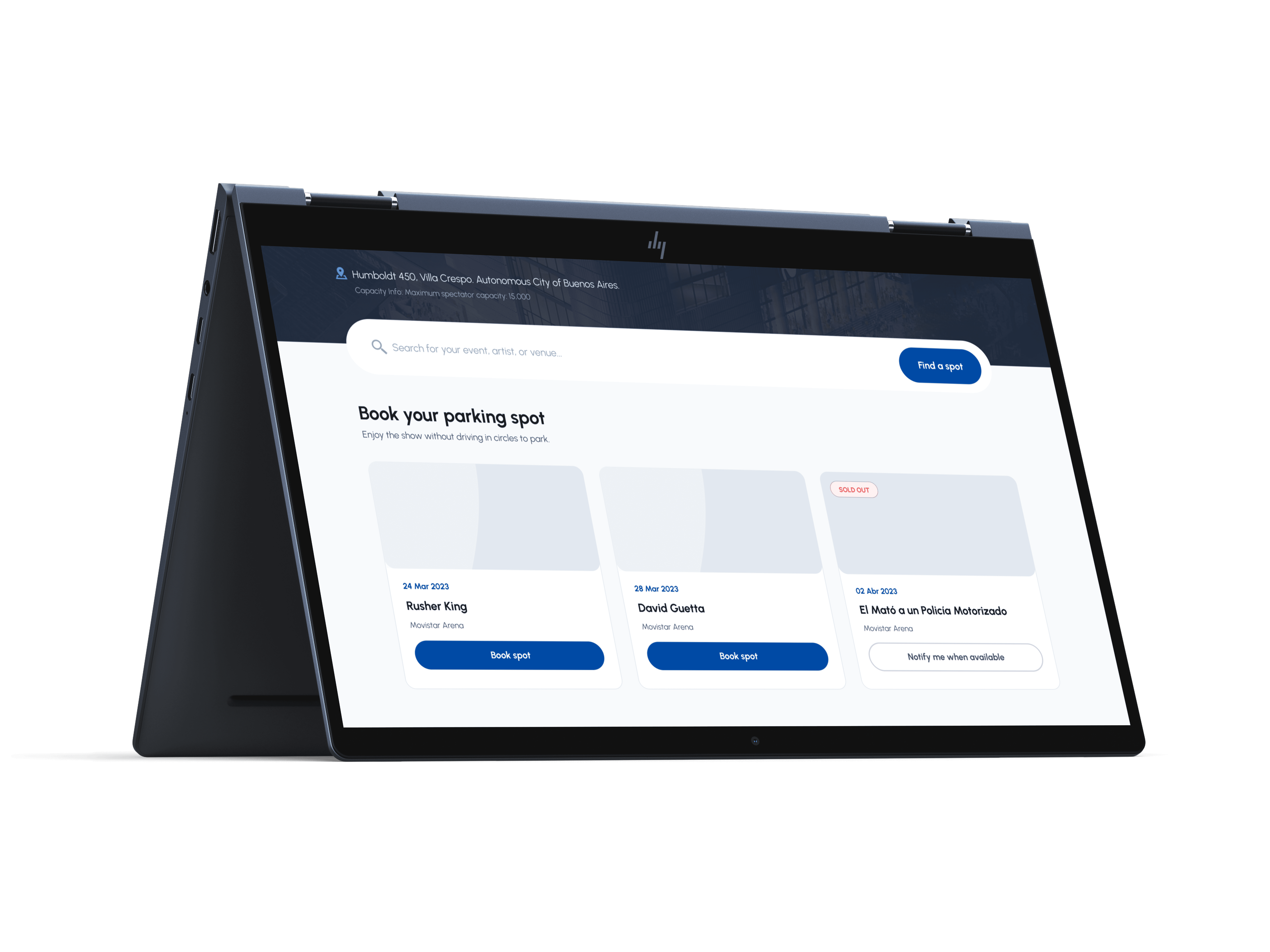
Seeker Parking: optimizing parking reservations for large-scale events and stadiums.
When I joined, Seeker had a working draft — but it was struggling. Early Hotjar testing showed real user friction, and the interface failed basic accessibility standards outright. On top of that: tight deadlines and no established design guidelines, which meant the turnaround had to be fast and user-centric at the same time.
The product needed to bridge two very different contexts of use.
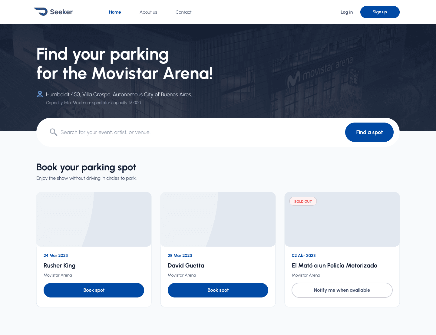
Discovery & booking — desktop
Users researching and reserving a parking spot from home, days ahead of the event, with time to compare options.
Access & navigation — mobile
The same users, now navigating traffic on event day, needing quick and stress-free access to their pass and lot details.
As lead product designer in a lean startup, I owned the redesign end to end.
UI kit and system restructure
With no existing guidelines and no time to invent one from scratch, I leaned on proven Material Design patterns to get visual consistency fast and speed up the handoff to development.

Accessibility, not as an afterthought
I overhauled the color palette and typography, testing rigorously with Adobe Contrast Checker, so the final product met WCAG standards and worked for users with color vision deficiencies specifically — not just on paper.

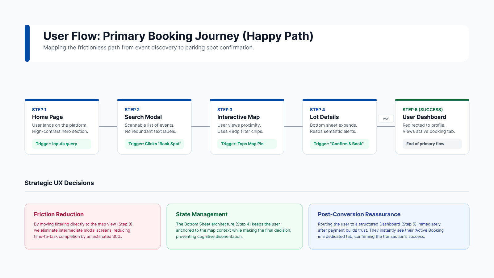
Simplifying the core flow
I streamlined the search-and-reserve process so it was faster and easier for everyone — not just power users comfortable with the old, cluttered version.
I worked directly with the product owner, based in Spain, while I was in Argentina — full time zones apart. That gap is exactly what my remote-work background is built for: clear async handoffs kept momentum without slowing down the tight deadline.
Brought the interface up to accessibility standards it had never met before.
Distinct contexts — desktop research and mobile day-of-event — unified into one system.
Shipped inside a tight startup deadline, fully async across two countries.